
Making water safe to drink, anywhere.
When you work with a brand like LifeStraw, the stakes are different. They aren’t just selling a water bottle for the gym; they are selling a survival tool that filters out parasites, bacteria, and microplastics.
But when we looked at the raw product, we ran into a problem that every industrial designer knows well: The “Container Trap.”
Physically, a LifeStraw product is a durable plastic vessel. If you visualize it strictly as “hardware”—focusing on the polymers, the lid, and the grip—you end up selling a container. You make it look like a commodity.
But a customer buying a LifeStraw isn’t looking for a place to store water. They are looking for the assurance that the water inside won’t make them sick.
We realized we had to stop visualizing the jar and start visualizing the result.
 The Hero is the Water
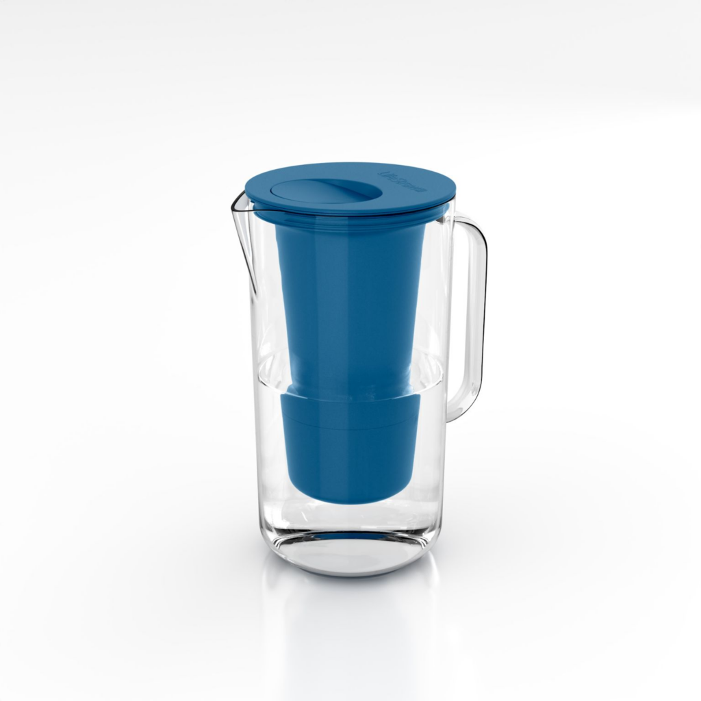
Technically, rendering a plastic cylinder is easy. But rendering “safety”? That is where the craft comes in.
We established a rule for this project: The product is the mechanism, but the water is the hero.
If the water looked even slightly murky, stagnant, or “digital,” the entire promise of the product would fail. The human brain has a deep, primal instinct for detecting unsafe water. If the refraction is off, or the shadow is too heavy, it looks “dirty.”

Engineering Serenity
To solve this, we stepped away from the CAD files and started studying nature.
We spent days analyzing references of “pure” water—glacial pools, mountain springs, and laboratory samples. We weren’t just looking at transparency; we were looking for serenity.

We treated the hardware—the hollow fiber membrane filter—as the supporting actor. We modeled it with extreme precision (down to the micron) to show the engineering, but we used lighting to make it recede slightly, letting the crystal-clear water take the stage.

The Human Eye: Curating the Invisible
You can’t automate ‘serenity.’ While our software handles the physics of light, it requires a human eye to handle the feeling of the image.
Every visual we produce goes through a critique session with our Creative Leads. We aren’t just looking for technical glitches or pixel errors; we are auditing the emotional logic of the scene—the light, the weight, and the physical truth of the object:
-
- Ergonomic Truth: Form isn’t just about geometry; it’s about weight. In early drafts, the pitcher’s glass handle looked thick and blocky, making the product feel heavy and cheap like molded plastic. We refined the glass thickness until it lost that “industrial weight,” ensuring it felt like a premium, elegant vessel you would actually want to lift.
-
- Optical Logic: Physics is everything. If the blue filter drops straight down into the water without bending, the water looks like empty air. We ensure the software respects the Index of Refraction, forcing the water to visibly magnify and distort the filter behind it. If the liquid doesn’t behave like a lens, the brain rejects the image as fake.

Tactile Contrast: In a white void, the materials have to tell the entire story. We meticulously balance the finishes—ensuring the sharp, cold reflection of the clear glass doesn’t overpower the soft, matte texture of the blue filter. The glass needs to feel pristine, while the matte plastic whispers durability and engineering.

The Result: Instinctive Trust
The final visual doesn’t force you to read the fine print. You don’t need to see the text “Filters 99.9% of bacteria” to understand what the product does.
You feel it.
By emulating the visual language of pure water, we bypassed the logical brain and spoke directly to the customer’s instinct. The product no longer looks like a plastic accessory; it looks like a precision instrument for survival.
That is the difference between “rendering a product” and Product Integrity. We didn’t just render a jar; we visualized trust and purity.

Founder’s Note
“In product visualization, accuracy is the baseline, but emotion is the goal. For a water filter, the ‘Product Integrity’ doesn’t lie in the shape of the nozzle, but in the clarity of the water. If the buyer can’t ‘feel’ the purity through the screen, the image has failed. We didn’t just render a jar; we rendered peace of mind.”
— Keshav Vijayaraghavan, Founder, House of Blue Beans